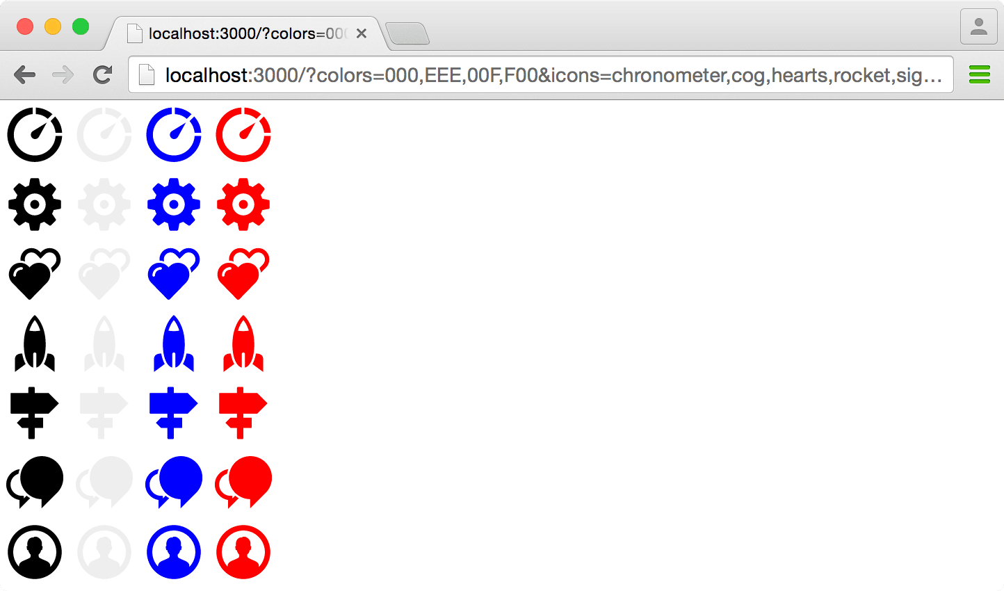
Use of the icon font is in decline. Recently it’s been argued that there are many good reasons to think about not using them and switch to using SVG images instead. At the Financial Times we agree that, on balance, it’s time to explore the transition for ourselves.
Browser support for SVG is very good; over 94% of browsers have full compatibility with the SVG 1.1 spec and you can raise that to 96% if you don’t require the use of masking.
Depending on your situation you may be able to discount supplying a fallback to the remaining 4% but it’s worth considering that the ability to view icons may be essential to your site’s visitors. Arguments about bad user experience aside, many websites do rely on using icons to navigate, toggle important menus, close prompts or perform important actions such as logging in and out.

Icons are often employed without accompanying text in space-constrained interfaces. Users must rely on these to perform key tasks.
At the FT our icon set is part of Origami – the Financial Times’s unified branding and web development kit – which must support company wide use-cases, be easy to use and provide a dependable, robust experience. With an audience as large and businessy1 as the FT’s this mandate includes the provision of proper fallbacks for much of the 4% that don’t understand Scalable Vector Graphics.
As it turns out, that’s hard.
The markup
There are multiple ways of implementing SVG icons;- inline elements, images or backgrounds. With the requirement to provide a sturdy fallback the choice is already made:
- Inline
<svg>elements with fallback are too complex. A plain<img>element relies onsrcsetwhich is not supported in IE, Opera Mini nor Android stock. Fallback images require a separate request for each icon. ✘ - Background images have been used since the early 2000s to implement sprites and projects upgrading from font icons wouldn’t have to drastically change their code ✓
The old webfont based icons are implemented by adding a base class and a variation class for the symbol required. Being a font it will inherit colour and size from its parent. A sprite based background image approach cannot inherit colours or size so extra classes for size and colour are required:
<!-- current font based implementation -->
<span class="icon icon--{symbol}"></span>

<!-- proposed future implementation -->
<span class="icon icon--{size} icon--{colour} icon--{symbol}"></span>
The sprite sheet
With a fallback image being so important using SVG fragment identifiers was not an option, I’d need to layout each icon in a regular, non-overlapping manner just like we did back in 2004.
Every SVG sprite tool I’ve tried can output a sprite sheet in a single colour, either copying from the source verbatim or including a setting to override it. I really wanted to avoid generating separate files for each of our 20+ colour palette so we had to roll our own system.
At FT we have a lot symbols and the aforementioned large colour palette so we thought it could be unfair to force every site user to download a huge sprite sheet if a product only uses a few icons. I prototyped a small application that can generate a sprite sheet containing only the requested symbols and colours.
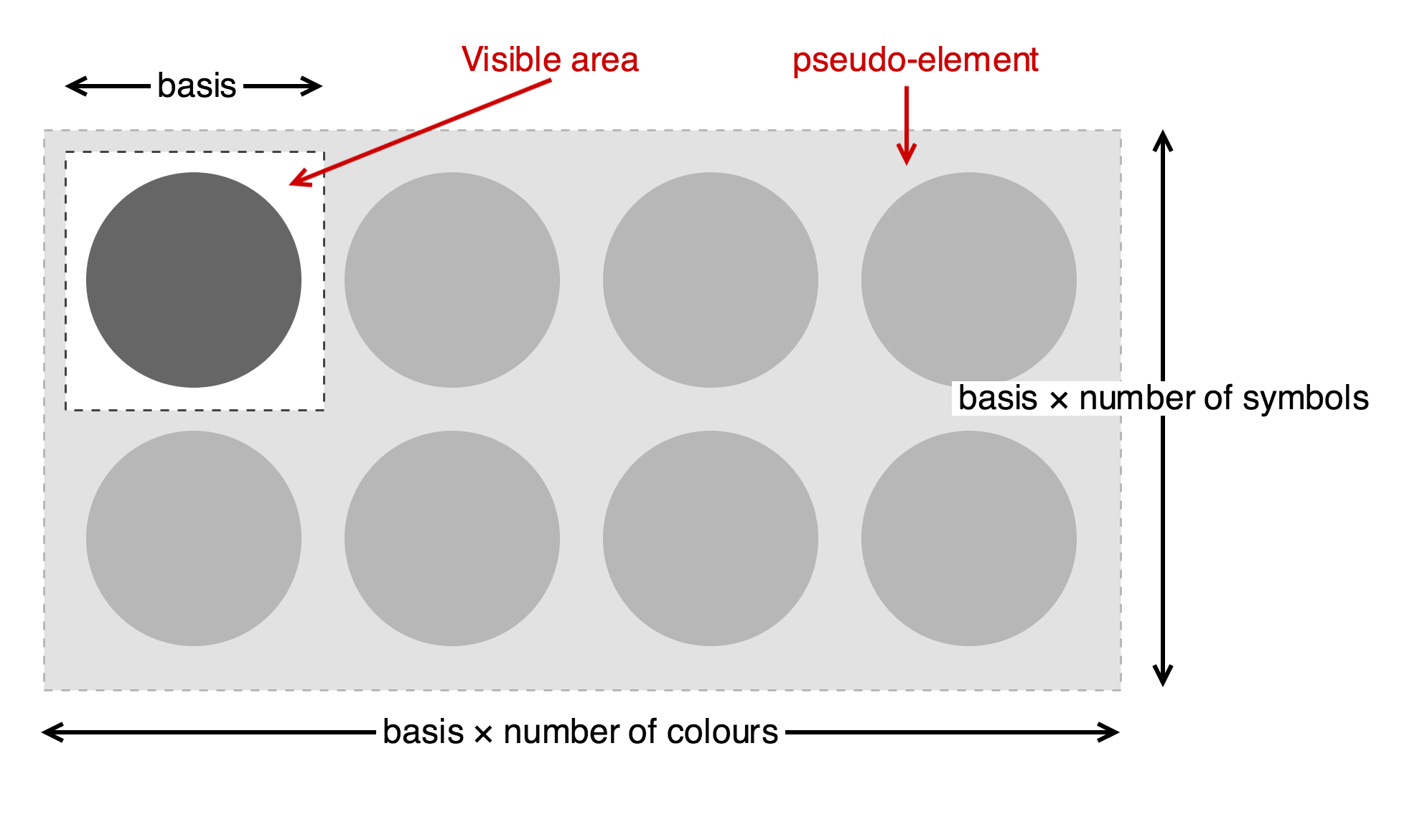
The application works by extracting the paths out of the source SVG files, runs some optimisations and includes them in the output as definitions. Each definition has a viewbox calculated so that they occupy an equal space. Definitions have no visible product themselves so the program loops over the requested colours, references each path and applies the correct fill to it.

The SVG sprite generator pulls the paths out of the individual source SVG files, optimises them and calculates a viewbox so that they occupy an equal space. The program loops over the requested colours and references each path, applying a fill to it
Right now we’re only using the system to generate static files – both SVG and PNG – but we may implement something similar at a later date for just-in-time sprite sheet generation if we see demand for it.
The styles
Here’s the initial Sass code. You may frown, tut and sneer now and I’ll explain afterwards. The color and symbols included in the sprite sheet are defined first along with the display size variations:
$icon-sizes: (16, 24, 36, 48);
$icon-colors: ('black', 'white', 'blue', 'red');
$icon-symbols: ( 'chronometer', 'cog', 'hearts', 'rocket', 'sign', 'speech', 'user');

.icon {
  position: relative;
  display: inline-block;
  overflow: hidden;

  &:after {
    content: '';
    position: absolute;
    width: percentage(length($icon-colors));
    height: percentage(length($icon-symbols));
    background-image: url('sprite-sheet.svg');
    background-size: 100%;
  }
}
It might seem strange that I didn’t simply apply the sprite sheet as a background image to the .icon element but instead added the complexity of a pseudo-element. This is because the sprite sheet uses both axes with colours flowing from left to right and symbols running from top to bottom but background-position cannot be specified for an individual axis.
Using background positioning alone would demand defining styles for every combination of icon and colour – that’s an extra 1000 declarations for the FT’s 50 symbols and 20 colours!
Using absolute positioning on a pseudo-element works in every browser and the left and right properties can be specified using separate classes; .icon--{colour} for the horizontal axis and .icon--{symbol} the vertical.
If applying a background image had been viable it would still need scaling so that each icon filled the containing element whatever its display size. The sprite sheet is divided into regular, equally sized squares and the number of colours and symbols on the sprite sheet are known so the scale can be calculated – simply 100% (the width of the element) × the number of colours/symbols. However, rather than using these values to set the background-size they’re used to set the dimensions of the pseudo-element and the sprite sheet set to fit that.

The sprite sheet is divided into regular, equally sized squares and the number of colours and symbols on the sprite sheet are known so the scale can be calculated.
So the setup is done but it’s not useful on its own. Classes are needed to specify the size, colour and symbol to display. With these parameters all defined in lists they can be iterated over to automatically generate the declarations for each:
@each $size in $icon-sizes {
  .icon--#{$size} {
    width: $size + px;
    height: $size + px;
  }
}

@each $color in $icon-colors {
  .icon--#{$color} {
    &:after {
      $color-index: index($icon-colors, $color);
      left: percentage($color-index - 1) * -1;
    }
  }
}

@each $symbol in $icon-symbols {
  .icon--#{$symbol} {
    &:after {
      $symbol-index: index($icon-symbols, $symbol);
      top: percentage($symbol-index - 1) * -1;
    }
  }
}
For browsers that support SVG the work is now done! You can check out a demo on CodePen.
Now for the hard bit…
The fallback
The browsers that don’t support SVG can be roughly split into two groups: old Internet Explorer (< IE9) and the stock Android browser on Froyo, Gingerbread et al. All of these browsers need a raster image fallback which isn’t as simple as just specifying two background images, they also have to be prevented from downloading and trying to apply the SVG file.
This was done by using the invisible gradient trick as a proxy for SVG support. It’s not perfect (IE9 and Android 3’s stock browser which do support SVG will be cut out) but it’s good enough:
.icon:after {
  background-image: url('sprite-sheet.png');
  background-image: -webkit-linear-gradient(transparent, transparent),
    url('sprite-sheet.svg');
  background-image: linear-gradient(transparent, transparent),
    url('sprite-sheet.svg');
}
With the old stock Android browser working well it was time to tackle old IE and any other browsers that don’t support CSS3 background options.
One option–as with colours–was to provide a separate sprite sheet for each size variation. It’s possible to both pre-generate or supply the sprite sheets on demand via an image service but this technique would mean extra requests and also raises issues with targeting only the browsers that needed it. This option is only really viable if you’re willing to live with these ugly downsides.
In old IE there are ActiveX filters and the AlphaImageLoader has a sizingMethod option which can be used to mimic background-size: 100% 100%. Unfortunately filters cannot be applied to pseudo-elements so quirky proprietary hacks couldn’t be utilised this time.
I solved the problem with another non-standard property, zoom. Because the icon element must be given dimensions and the sprite sheet has been generated at a known size the magnification ratio can be calculated. It does mean that the icon element cannot be given a relative size but I think that’s a minor caveat to work around.
Somewhat irritatingly, the absolute positioning of the element must also be re-calculated based on the native size of the sprite sheet too as these properties are also magnified.
Each of the fallback properties are overridden by wrapping the fall forward in a media query. It’s totally safe to conflate the support of media queries with CSS3 background options.
$icon-intrinsic-size: 50;

@each $size in $icon-sizes {
  .icon--#{$size} {
    width: $size + px;
    height: $size + px;

    &:after {
      zoom: 1 / $icon-intrinsic-size * $size;

      @media all and (min-width: 0) {
        zoom: 1;
      }
    }
  }
}

@each $color in $icon-colors {
  .icon--#{$color} {
    &:after {
      $color-index: index($icon-colors, $color);
      left: $icon-intrinsic-size * ($color-index - 1) * -1 + px;

      @media all and (min-width: 0) {
        left: percentage($color-index - 1) * -1;
      }
    }
  }
}

@each $symbol in $icon-symbols {
  .icon--#{$symbol} {
    &:after {
      $symbol-index: index($icon-symbols, $symbol);
      top: $icon-intrinsic-size * ($symbol-index - 1) * -1 + px;

      @media all and (min-width: 0) {
        top: percentage($symbol-index - 1) * -1;
      }
    }
  }
}
In conclusion
I suspect most of you won’t be facing the same requirements as the Origami team at the FT. If you don’t require a non-SVG fallback or your icons are intended to be displayed at a single size then SVG sprites are almost as straightforward to implement as an icon font. With such stringent requirements however… we’ll see. We’ve launched a beta implementation and hope to gather as much feedback as possible which I’ll update here in due course. Some of the questions I’d like to answer are:
- Would it be more efficient to provide a single high resolution PNG instead?
- Is there a performance issue when using many SVG icons on a page?
- Do the downsides of icon fonts outweigh the complexity of implementing SVG icons (with a proper fallback)?
-
IT upgrades at large companies are complex, expensive and can take years. It’s not your user’s fault! ↩