Making website layouts can be hard. We’ve performed CSS gymnastics to achieve layouts that can seem so simple on first appearances, re-appropriating floats, table layout and absolute positioning into every possible combination.
The aim of CSS was to separate content and style but our layouts are as tied to our markup as ever, causing added bloat to almost every web page.
News design
When we open a newspaper we expect every free centimetre of space to be filled with a patchwork of content. Each page is laid out with modules organised in a manner that is both economical to print and to broadly convey the importance of each piece.

Despite 128 years between the two covers the lineage between them is obvious.
The design of news web sites have generally followed the rules introduced by their paper counterparts, utilising the same combination of pictures, text and ads presented in a close knit pattern.
Due to a lack of suitable tools this has been a nightmare for the web developers at news websites, further complicated in recent years by the wide range of screen sizes a modern site should respond to.
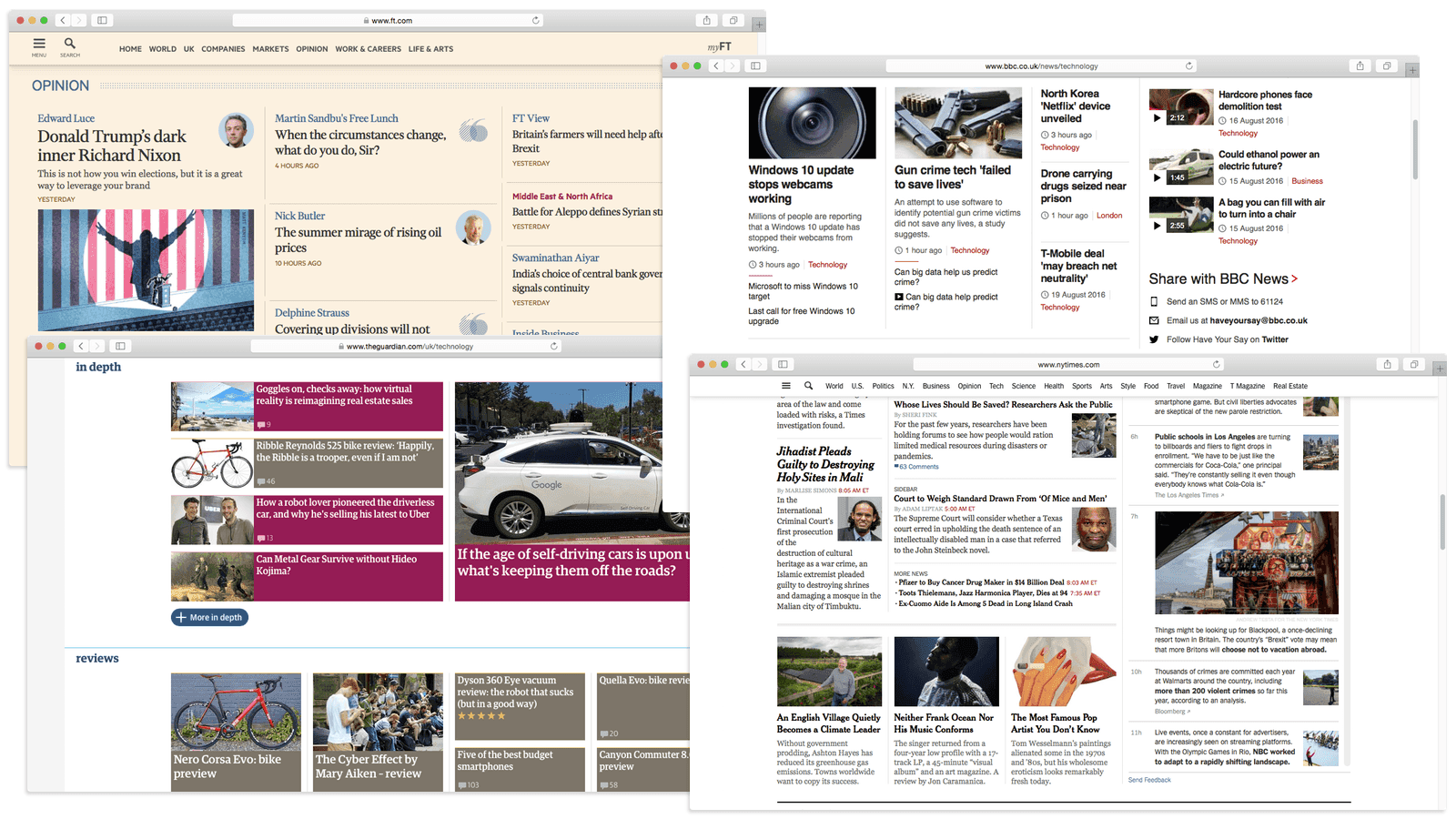
News web sites have generally followed similar design rules to their paper counterparts.
Creating layouts as complex as those shown above requires a lot of code. Story headlines on these front pages are, on average, nested within 15 parent elements!
To generate so much HTML there’s a lot going on behind the scenes; a list of stories is poured in but when they emerge they’ve been wrapped in container elements, divided into columns and lists… each decorated with class names describing size, position and behaviour at different viewport sizes.
HTML and CSS are just markup languages so to describe layouts in this way we have to delegate the logic elsewhere, whether that’s into templates or other server-side code.
All of this means that, despite our best intentions, stylesheets will have too many rules, templates will contain too much logic and your team’s headspace will rapidly run out when trying to remember the ins and outs of the whole system.
A step change
The 12 or 16 column grid revolutionised web layout in the late 2000s. Most of the sites I’ve built since then have been based on closely related foundations but CSS grid layout is nothing like the CSS grids we’re used to.
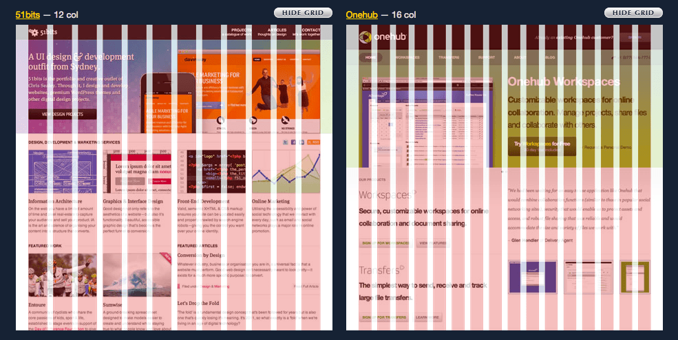
Projects like 960 Grid System revolutionised web layout in the late 2000s. CSS grid layout is nothing like it.
Floating elements left and right has gotten us a remarkably long way, and flexbox has made previously tricky layouts wonderfully simple. But both of these tools only really work in one dimension; the former was never intended to be used in this way (it’s a hack) and flexbox will make your head spin when it wraps onto the cross axis. Of course there’s also table layout but it lacks the grammar in CSS to be widely useful.
For these reasons a layout that appears simple can be surprisingly convoluted to implement and completely obtuse to the uninitiated:
The implementation embedded above will be familiar to you if you’ve used a CSS grid framework within the last decade. Items are nested in floating column elements which are themselves inside a wrapper element with a negative left margin and properties to trigger a new formatting context (overflow: hidden)… it’s a bunch of hacks used so extensively we don’t even blink.
If you’re a bit more hip then you’ll know we don’t need to use so many hacks for modern browsers because the same layout can be achieved using flexbox. However, even this requires ~40% more lines of code than the same thing implemented using CSS grid layout:
I know lines of code alone are not a reliable indicator of complexity but some lines are more important than others, namely:
✨ I didn’t have to add any extra markup ✨
The layout has been declared with CSS alone. This is an amazing feature that the specification modestly leaves between the lines:
This CSS module defines a two-dimensional grid-based layout system, optimized for user interface design. In the grid layout model, the children of a grid container can be positioned into arbitrary slots in a predefined flexible or fixed-size layout grid.
Grid layout has the chance to deliver a huge shift in the way we rationalise layout systems for the web. Even when approaching relatively simple components like the one above we can drastically reduce the complexity of the markup and styles currently required.
Applying to news design
So far, grid layout is looking like a promising tool to combat news website complexity. I’ve just demonstrated that layouts can be constructed without adding extra markup and with fewer lines of hack-free CSS. Arranging a few coloured blocks is not a real-world use case, however – so let’s put it to the test.
I know first-hand how complicated the Financial Times (FT.com) front page can be and because I don’t work with it very often I always find it a challenge to understand. To really test grid layout I’m going to re-create the FT.com front page using it.
Starting at the top, the opening (and most complex) section of the page contains 12 items consisting of 11 headline stories and 1 sub-section:
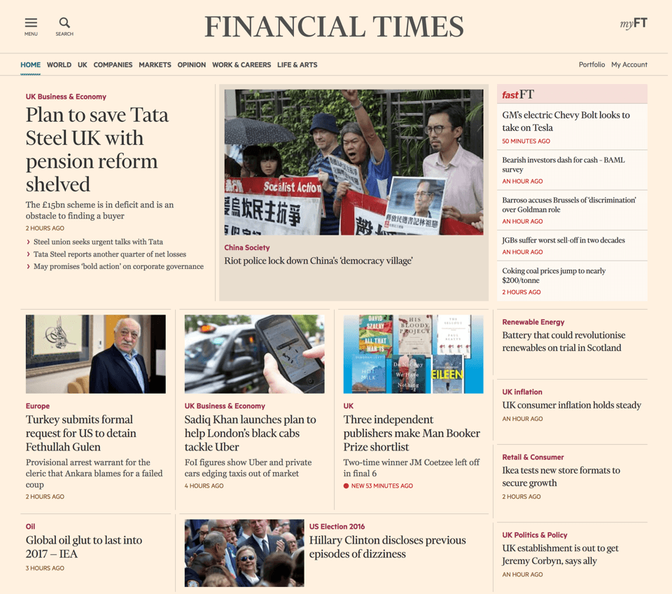
In its most minimal form we can represent this layout with a HTML skeleton like this:
<section class="Grid Grid--headlines">
  <h1 class="Grid-title">Headlines</h1>
  <article class="Story">…</article>
  <article class="Story">…</article>
  <article class="Story">…</article>
  <article class="Story">…</article>
  <article class="Story">…</article>
  <article class="Story">…</article>
  <article class="Story">…</article>
  <article class="Story">…</article>
  <article class="Story">…</article>
  <article class="Story">…</article>
  <article class="Story">…</article>
  <section class="FastNews">…</section>
</section>
The FastFT sub-section appears third in the layout when reading from left-to-right but items in a grid container may be “positioned into arbitrary slots”. I think it makes more sense for this sub-section to appear after the headline stories in the document outline so I’m taking advantage of this feature and moving it into last position.
✨ My layout is no longer constrained by source order ✨
Like many websites the FT site has been designed to fit a 12 column grid which I have overlaid on the screenshot below:
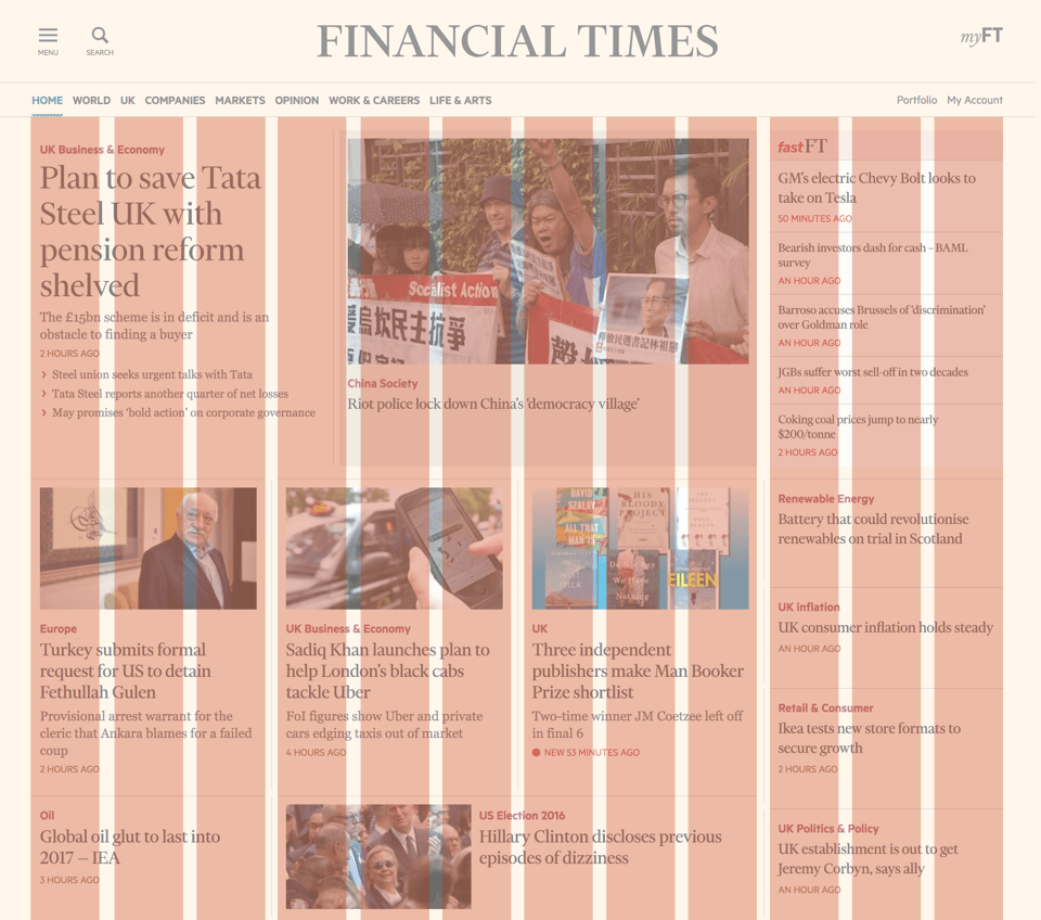
The content neatly lines up with the columns but it’s not divisible into equally sized rows. This is because the site has been built with a fixed horizontal layout but the vertical space is dictated by the content.
Step 1 is to define a 12 column grid but skip declaring any rows. Decisions about row sizing decisions will be delegated to the grid algorithm.
.Grid {
  /* create a grid container */
  display: grid;

  /* gutters between grid items */
  grid-gap: 20px;

  /* define 12 equally sized columns, 1fr = 1 fraction */
  grid-template-columns: repeat(12, 1fr);
}
Step 2 is to size the first two stories by declaring how many columns they span. By default the grid algorithm will implicitly flow items from left-to-right beginning from the first row.
.Story:nth-of-type(1) {
  grid-column: span 4;
}

.Story:nth-of-type(2) {
  grid-column: span 5;
}
Visually the FastFT sub-section is next but I placed it last in the markup so if I continue to use implicit placement then it will stay in last position. Instead I must explicitly state its position by determining its top, bottom, left and right boundaries.
In grid layout terminology these boundaries are named grid lines and are defined by the beginning and end of columns and rows. I’ve drawn the left-to-right grid lines created by my columns and numbered them in the image below:
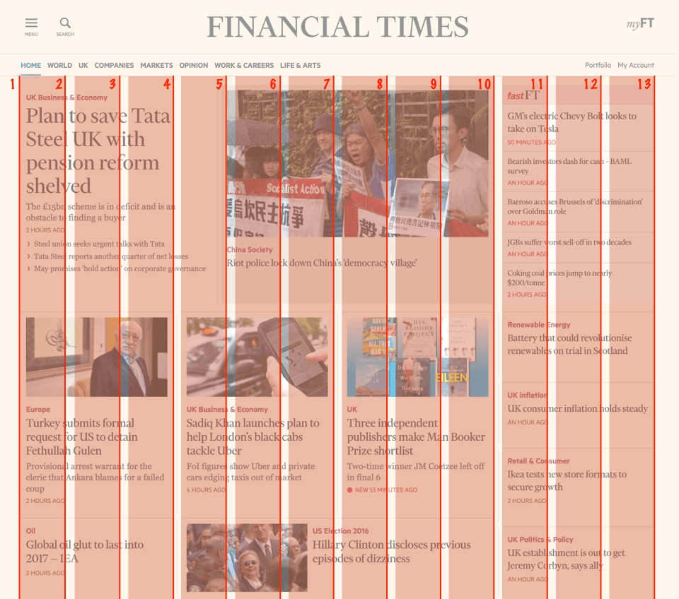
There are placement properties that can control the grid line boundaries individually (grid-row-start, grid-column-start, grid-row-end, grid-column-end), per axis (grid-column, grid-row) or all together (grid-area) - so there’s plenty of flexibility.
Step 3 is to explicitly define the grid area for the sub-section.
.FastNews {
  /* <start> / <end> */
  grid-row: 1 / 2;
  grid-column: 10 / 13;
}
Step 4 is to declare the column spans for the next 5 stories. They will automatically flow around the FastFT sub-section.
/* select stories 3-6 */
.Story:nth-of-type(n+3):nth-of-type(-n+6) {
  grid-column: span 3;
}

.Story:nth-of-type(7) {
  grid-column: span 6;
}
It’s not quite so straightforward for the final 4 stories however. They flow vertically along the right edge as shown in the image below:
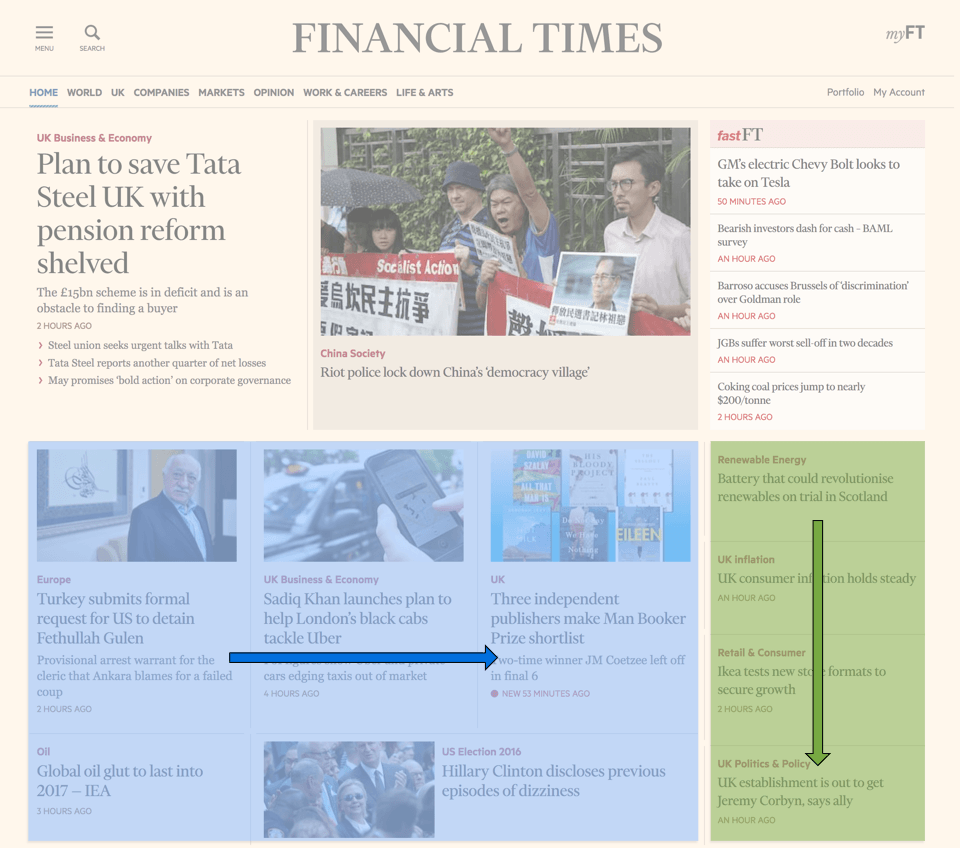
Step 5 is to clear the right-hand-side by wrapping stories onto a new row to prevent them encroaching into the final 3 columns.
.Story:nth-of-type(6) {
  /* wrap to the first grid line */
  grid-column: 1 / span 3;
}
Step 6 is to instruct the final 4 stories to start from the 10th grid line and span the remaining columns. They could also each be explicitly placed but I want to leverage another feature of the browser’s new algorithms instead.
/* select stories 8-11 */
.Story:nth-of-type(n+8):nth-of-type(-n+11) {
  grid-column: 10 / span 3;
}
Annoyingly, this will leave a gap between this group of stories and the FastFT sub-section as they will continue along the same row as their predecessors. Currently such a layout conundrum is difficult to solve without resorting to JavaScript tools such as Masonry or bodging with fixed dimensions. With grid layout there’s no need to bodge.
Step 7 is to set the grid algorithm to dense. This will tell the browser to backtrack and attempt to fill in any gaps.
.Grid {
  …
  grid-auto-flow: dense;
}
Finally, not everything aligns vertically yet because there’s an imbalance of rows. On the left side stories are distributed onto 3 rows but on the right they span 5.
Step 8 is to make some stories on the left span multiple rows.
/* select stories 3-7 */
.Story:nth-of-type(n+3):nth-of-type(-n+7) {
  grid-row: span 2;
}Phew… OK, this demo (if you’re unable to view the demo here is an alternative video) is still just coloured blocks but I now have all the tools and techniques I need to re-create the complex choreography of the FT.com front page. By mixing in a few media queries, a little typography, some (fake) content and a splash of salmon gives us something like this:
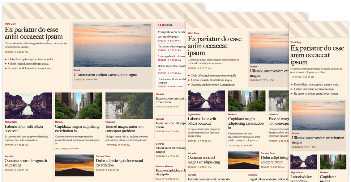
Jazzy, right? You can check out the demo and the source code on Github. I think this is an order of magnitude more elegant and straightforward than anything I could have written just a few years ago.
Conclusion
I’ve worked with so many developers who are indifferent or disparaging towards CSS because trivial things often require illogical solutions. Grid layout is expressive and logical and it solves a number of fundamental gripes. When combined with flexbox we have a set of layout systems for the browser that are approachable, powerful and so much less irritating!
At the time of writing the spec has just begun being prepared for candidate recommendation status (update: it is now!). I enthusiastically encourage you to get on board with grid layout and keep an eye on the Can I Use support tables.
There are currently very good implementations shipping in Chrome and Safari technology preview behind a flag. Support in Firefox is looking great in recent nightly builds (v51) as well. Right now, Edge only supports a prefixed, incompatible early version of the spec but it is considered a high priority feature.