For the last year I’ve been leading an effort to replace the system used to assemble and deliver the front-end of FT.com. We’ve redesigned and rebuilt all of the functionality needed by 18 user-facing services to compile and optimise their client-side code, render global UI components, and implement all manner of glue and important bits besides.
Although the old system had coupled us to some imperfect technical decisions made 5 years ago (which is an age in JavaScript!), this wasn’t our main motivation for replacing it. We actually replaced it for two reasons:
- It was a critical part of our stack that had slowly decayed and become a haunted forest.
- The site was getting slower so we needed to stop the rot and re-establish a performance benchmark.
This post is about how we have tackled number 1.
Replacing any system with so much complexity and responsibility is risky and it could be an expensive waste of time if our new version also decays after my team moves on. To try and avoid history repeating itself we spent a lot of time thinking about the causes of code decay and how we could design a more sustainable and supportable system for the 40+ developers across the department.
Problem: Haunted Forest

The decay of our old front-end system began after its development team disbanded. At first this didn’t cause too many problems because the main contributors were still around to offer advice and make improvements when they could but after they moved away the loss of knowledge and diffusion of responsibility meant upgrades were ignored, refactors were started but not finished, and hacks piled up.
To begin our replacement project we went file-by-file through the old system documenting everything and surveyed a range of developers who had worked on FT.com. By asking our colleagues what they had found most challenging and analysing the codebase ourselves we uncovered 4 main themes:
-
The system’s scope and responsibility was unclear. We found it was was littered with undocumented, untested, and mysterious stuff. Developers told us they found it hard to extend, had repurposed features, and even added application-specific code because they didn’t know what else to do 😬.
-
The internal architecture was hard to navigate and rationalise. We struggled to map out the tangled relationships between components and there were many assumptions baked in. Our colleagues told us they had usually avoided looking inside and treated it as a black box.
-
Making a new release was scary. We found that the test suite no longer adequately covered the whole system and a failed release could block feature teams from shipping (not very microservices!) Most of the people we spoke to told us that they didn’t feel comfortable making changes.
-
The documentation and history didn’t provide enough information. A number of features existed without any context so we did not know if they were still needed or who might care about them. We heard from several people that it was hard to delete things.
Overall, it was an intimidating codebase to contribute to and those who were brave enough often found that their “quick fix” could turn into a slog. To give our replacement the best chance of success we had to tackle these issues and prevent them from happening again.
Solution: Break it apart

Animation by Anchor Point
After dissecting the old system it wasn’t obvious how we could assemble the long list of features we needed into one piece of software and the more we learned about how it had been used the more overwhelming it felt to try and design a single tool able to satisfy everybody’s needs.
Instead of worrying about this we decided to get going and start building features as separate pieces so that we could focus on solving one problem at a time. Eventually we had enough pieces to begin assembling them into small example applications for testing and to gather feedback. Textbook!
The secret to building large apps is never build large apps. Break your applications into small pieces. Then, assemble those testable, bite-sized pieces into your big application.
Well, not quite. At first we strived to make each part as generic as possible but as we got closer to shipping it became obvious that our idealism was only going to make migrating to the new system much harder. Changing course to a more utilitarian direction was tough but refocusing made it far easier to make decisions and to know when we were done.
While it is natural to focus on what a design must accomplish, experts also spend time thinking about what a design is not intended to do. In articulating and considering boundaries, they discover where they are over- and under-designing.
To emphasize our change of direction we rechristened our project with a no-nonsense name that helpfully defines its scope and purpose: Page Kit.
1. Define boundaries and purpose
Animation by bigbadbarth
One of the most obvious symptoms of decay in our old front-end system was the shared confusion about its responsibilities. Over time the boundaries between it and the services it powered became blurry with both sides making overreaching and brittle assumptions about each other that were tricky for us to unravel.
Adding to the confusion we found that lots of code appeared to be in the wrong place, seemingly far removed from where it was needed. For the same reason we also uncovered lots of dead code that we’d been shipping long past its expiry date.
To help future maintainers make good decisions about where (and where not) to put things we created logical boundaries by wrapping up each piece of functionality into separate packages. To help us decide what should and should not be a package we made up two rules:
- Each package readme must begin with one or two sentences defining what it is. This description should be used to decide whether or not new features are within scope.
- Page Kit is intended to cover the majority use case. It will power many applications so if a suggested feature only benefits a minority of them it cannot be included.
Following these rules meant splitting our system into lots of small packages which each solve or surface a single problem. We’ve created some really tiny packages just to increase the visibility of important information.
So far this decision has proven effective for enabling new contributors to feel orientated and allowed us to push back on several feature requests we felt were unsuitable.
2. Minimise cognitive load

Animation by Lame Kids Club
The implementation details of shared systems like Page Kit are unlikely to ever become widely known by all of the developers in the department. Most interactions they’ll have with the system will only be at the surface level with the documentation and interfaces.
But every developer in the department has a stake in the system and will need to contribute to Page Kit at some point. Some of those contributions will undoubtedly be written by colleagues who are having a frustrating day yak shaving who just want to get in and out again with minimal friction.
For this reason we’ve thought carefully about how developers approach the system for the first time and what we could do to set them up for the best chance of success. The effect of creating many small packages has given Page Kit a wide surface area but also ensured the implementation of each piece is shallow.
Our intention is that any developer will be able to scan the list of packages as if it were a table of contents, identify the piece they need to work on by its name or readme description, then focus their efforts on that part alone.
3. Build in layers of confidence

Animation by madebydot.tv
It can be worrying to make a small change to a large and complex system you’re not familiar with. To relieve the worry you might pair with or make sure your changes are reviewed by an expert in the system but they’re not always going to be available.
This is in part why we rely on automated tests but unravelling a failing test can be hard work when the direct cause isn’t highlighted. Providing fast and precise feedback is crucial for building a developer’s confidence in a system and encouraging them to return.
As a first step we’ve used TypeScript throughout. This was not a decision taken lightly because we’ve seen several projects at the FT fail to build momentum due to its esoteric error messages and lack of perceived benefit over time. Despite this we stubbornly assumed it would eventually prove beneficial in our case because we were planning to build many parts that had to slot together seamlessly.
I believe that TypeScript has (after some initial teething problems) proven valuable to us. It’s helped to keep our many interfaces aligned and has on a number of occasions been correct when we were adamant it was wrong. However, we’re aware that TypeScript can be a cause of frustration and raise the barrier to entry for new contributors so we’ve kept checks non-strict and have only insisted on adding types for public interfaces and any data which may be passed between them.
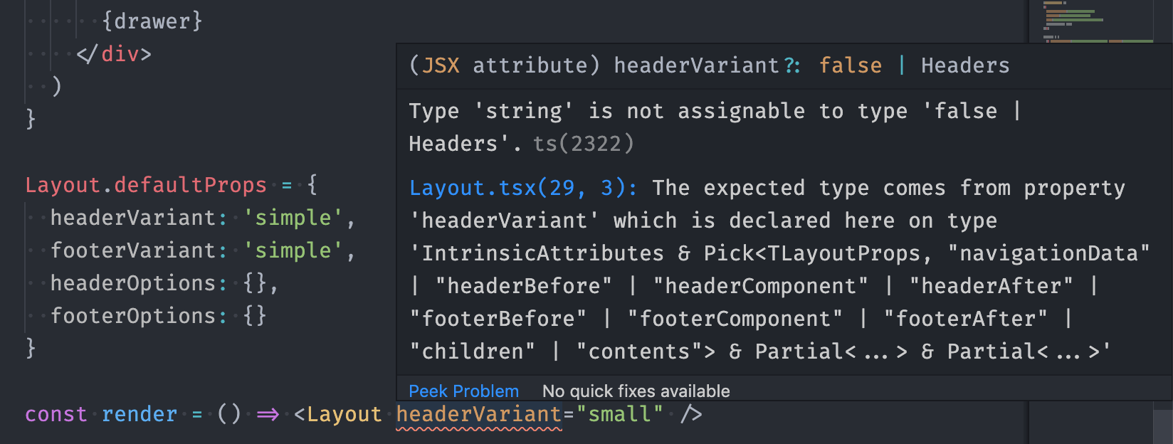
TypeScript errors like this can be tricky to unravel and it takes experience to filter out the noise but they can provide precise and immediate feedback when something is wrong.
On top of TypeScript checks we have unit tests for each package. These have been written using Jest (and ts-jest) which provides many options and integrations for running the tests continuously in the background. This, combined with our small and tightly scoped packages, means developers can be quickly alerted to the specifics which require their attention.
Finally, we have a suite of integration tests. These are run against several example applications we have built alongside Page Kit’s packages to demonstrate its various features. Our integration tests also use Jest because it has an active ecosystem of good quality plugins, like jest-puppeteer, which enable us interrogate the examples from all angles.
We hope that all of this means when pull requests show a green tick code authors and reviewers can feel confident that the changes will prove reliable.
4. Document absolutely everything
Animation by madebydot.tv
From staring at a piece of code you might be able to learn what it does and perhaps how it does it, but it probably doesn’t tell you why it’s there or who cares about it.
A recurring theme during the project was the need to perform software archaeology to find out why many pieces of code in the old system existed and who might rely on them. We needed this information so that we could decide whether or not we could delete things, communicate to relevant parties that changes were happening, and later verify if everything was still working.
The process of digging for information was not always straightforward, more than once we were faced with chunks of complex code copied from elsewhere opaquely described by the words “initial commit”. Roadblocks like these meant resorting to some abrasive tactics such as turning things off (or at least threatening to) just to see who reacted.
As well as reiterating how crucial a detailed and well formatted Git history is to Page Kit contributors we realised that there is often lots more useful information generated when building a feature than can be conveyed in code alone. We wanted information about key decisions to be kept in detail and be more resilient to future changes.
For our own part, we have recorded why and who made important technical decisions in their own documents. We hope these will remain easily accessible as the codebase evolves, as well as saving a large amount of time and breath re-explaining!
A few particularly important features have been given their own space where they are less likely to be affected by external changes. For example our analytics setup which is depended upon by many different stakeholders across the business has its own repository with its own documents folder recording the “what, why, when, who, and how?” that I was able to dig out for each custom tracking event.
Conclusion
Whether or not the design decisions we’ve embedded into Page Kit will ultimately lead to high codebase health in the long term, we will have to wait and see. At the moment the project is still fresh and its contributors and gatekeepers are taking pride in keeping it that way. One early indicator has been the positive feedback we’ve received from first-time contributors who have told us that they’ve been able to get up and running quickly which I hope proves the codebase structure, documentation, and testing are doing their job. If we can maintain this feeling of goodwill then we have a great chance of preventing another haunted forest emerging.
And one more reason to take pride and care in maintaining the health of Page Kit is that we have managed to make FT.com faster, halving our key Time To Interactive (TTI) metric across our main applications:
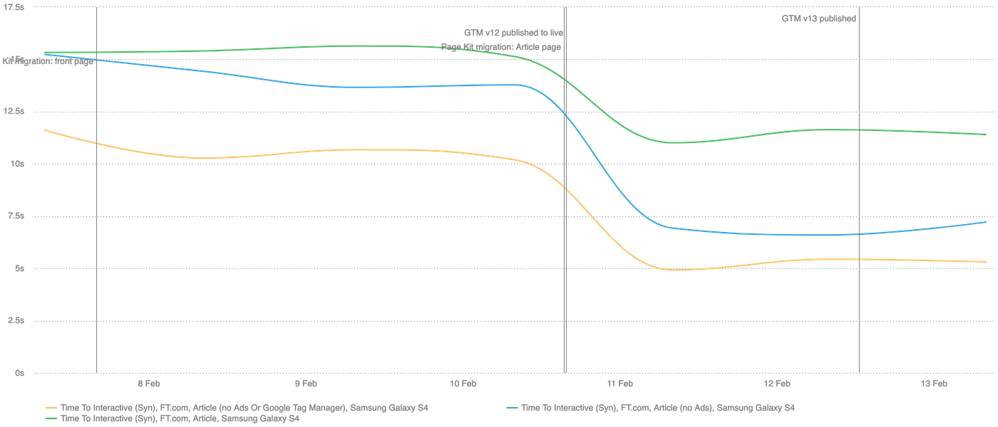
Our TTI metric as measured by Speedcurve has been halved across our front page, section pages, and article pages since migrating them to use Page Kit.
We’ll be writing more about the improved performance of FT.com in future, but for now you can view Page Kit on GitHub and if it looks like something you’d like to work on then join us: we’re hiring.
A massive thank you to Maggie Allen for her amazing contributions to the project and for proof reading this article 🙇♂️