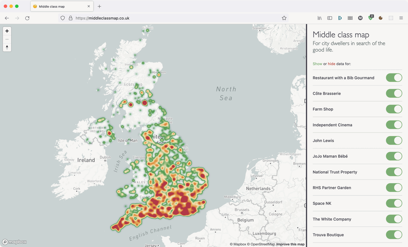
During the first lockdown of the pandemic in 2020 I launched a website “for city dwellers in search of the good life” which mapped out some arbitrarily chosen middle class things across the UK. It was primarily an effort to learn some more about web scraping (and be a convenient distraction from the crippling existential dread of the time) but the part I really enjoyed was visualising it all on the map.
When zoomed in the different data points are presented as pins but when zoomed out showing every pin on the map is impractical because there are just too many. To avoid this, I implemented a heatmap indicating the density of points instead.
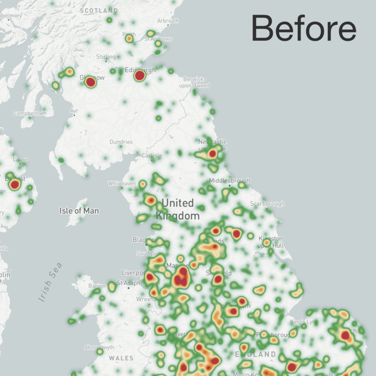
But the heatmap view was not very useful because the number shops and restaurants in an area generally corresponds to the number of people in that area to do business with, making it a proxy for a population map rather than highlighting outstandingly middle class places. There were plenty of exceptions if you looked closely and many small towns did stand out and many much larger places were absent but overall the population pattern appeared to be true.
In order to bring attention to the areas which genuinely are fancy and not just massive I needed to add weight to each map point, to boost those in areas with small populations and diminish ones in more dense urban areas.
I started by searching for “population data UK” and “population map UK” to see what sorts of data were out there. This soon led me to the government’s open data website where government departments, companies, and academic institutions all share different datasets. For my queries the results included simple map graphics, complex graphics with data embedded in them, spreadsheets grouping numbers into administrative boundaries, and a host of files for geographic information systems (GIS) of which I know nothing.
In fact, I didn’t know what many of these files were at all or how they might be used. All I did know was that my map was based on coordinates which tell you a point on a sphere (or sphere-ish thing) and all the data I could find, didn’t. So I let the files sit on my hard drive for nearly two years until I spotted them again last week.
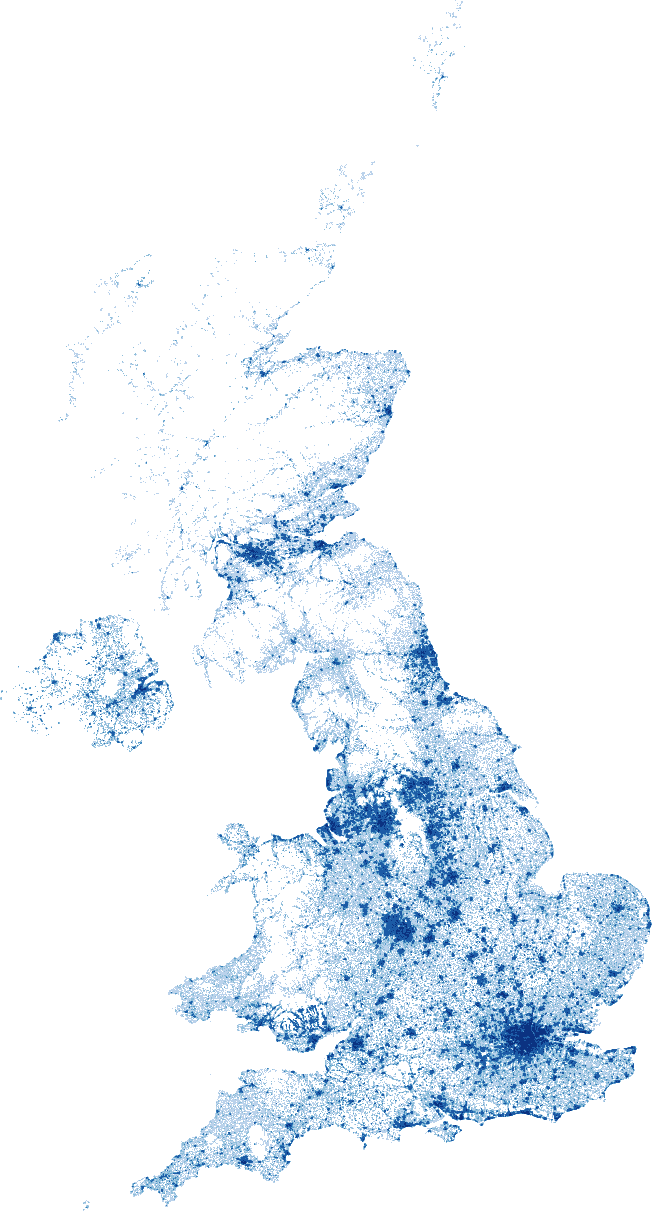
Amongst the things I had downloaded was this dataset which divided the population of the UK counted by the 2011 census into 1x1 kilometer squares. This sounded perfect but the output was not graphical, it was a text file with “squares” defined by rows of space separated values which the documentation identified as an ESRI ASCII grid. I hacked together a quick script to parse and visualise this dataset and sure enough it looks like the UK:
So to get the population data for each point on my map I needed to use their coordinates to match them to a square in the dataset, but whilst I knew the scale of the grid it was still two dimensional.
Joining the two is possible because the dataset is based on the British National Grid or “Ordnance Survey National Grid reference system” to give it its full title. This geodetic datum from 1936 divides the UK into a series of nested grids starting with a low 500x500 kilometer resolution down to a very high 1x1 meter resolution. Locations are specified first with letters to guide you through the low resolution grids then numbers of increasing precision determining “eastings” and “northings” within.
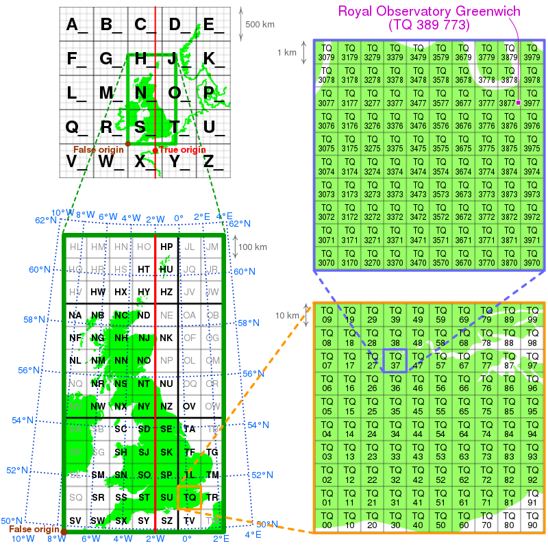
You can learn how to read grid references on this nice website.
Translating coordinates to the British National Grid is possible because the north-south axis of the grid is aligned to a specific longitude and I found several websites able to perform the conversion; the British Geological Survey even have an API! But before I started bombarding their service with requests for fancy farm shop locations I found a JavaScript library implementing the staggeringly complex maths required so I could perform the conversions on my own laptop.
By default the Geodesy library generates grid references in meters so I could helpfully skip past the letter based notation and convert the figures straight into the 1 kilometer resolution of the dataset. Once I had the grid reference it was simply a case of reading the parsed data from bottom to top then left to right:
const { LatLon } = require("geodesy");
const dataset = require("./dataset.json");

function getPopulation(lat, lon) {
  const coords = new LatLon(lat, lon);
  const osGridRef = coords.toOsGrid();

  const e_km = Math.round(osGridRef.easting / 1000);
  const n_km = Math.round(osGridRef.northing / 1000);

  return dataset[dataset.length - n_km][e_km];
}
Actually, it wasn’t quite that simple… although the code above was fetching the correct value for the grid references returned by the library the numbers were not what I expected and I was getting a lot of zeroes for places I knew had people living there.
To work out what was happening, I selected a dozen easily identifiable and well habited locations around the UK and cross-checked their coordinates and grid references online. Satisfied these values were correct, I plugged them into my function, and sure enough - I still got back unexpected zeroes. Unsure what was wrong, I decided to debug the problem by adding the locations to the map graphic I generated earlier and I could soon see the problem:
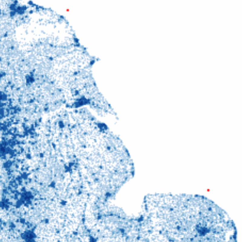
For reasons I don’t understand, it turns out that the edges of the dataset did not align to those expected by the library, so I simply added a few “calibration” pixels to the X and Y axes to correctly place the points on their true locations on the map. Finally, to ensure this couldn’t happen again - and account for other potential hazards like empty city centres and parks - I chose to sample the surrounding squares of the grid as well:
const dataset = require("./dataset.json");

function totalize(arr) {
  return arr.reduce((total, item) => {
    const value = item === "-9999" ? 0 : parseInt(item, 10);
    return total + value;
  }, 0);
}

function sampleGridData(easting, northing, size = 2) {
  // remember, values are read from bottom to top!
  const row = dataset.length - northing;

  return totalize(
    dataset.slice(row - size, row + size).map((cols) => {
      return totalize(cols.slice(easting - size, easting + size));
    })
  );
}
With each of my map points now fairly accurately decorated with a few kilometers square of local population data I could start applying a scaled weighting to them and thus small posh places across the country begin to stand out in my heatmap. Southwell outshines Nottingham, Dartmouth and Totnes dominate Devon, Altrincham dwarfs Manchester, Tenterden and Rye takeover Kent, and Henley-on-Thames looks down aloofly on Reading.